15: The Hierarchy of Needs in Quick Google Cardboard Hacks
This week I’m going to be writing about some of the UX challenges encountered while creating Cardboctober hacks.
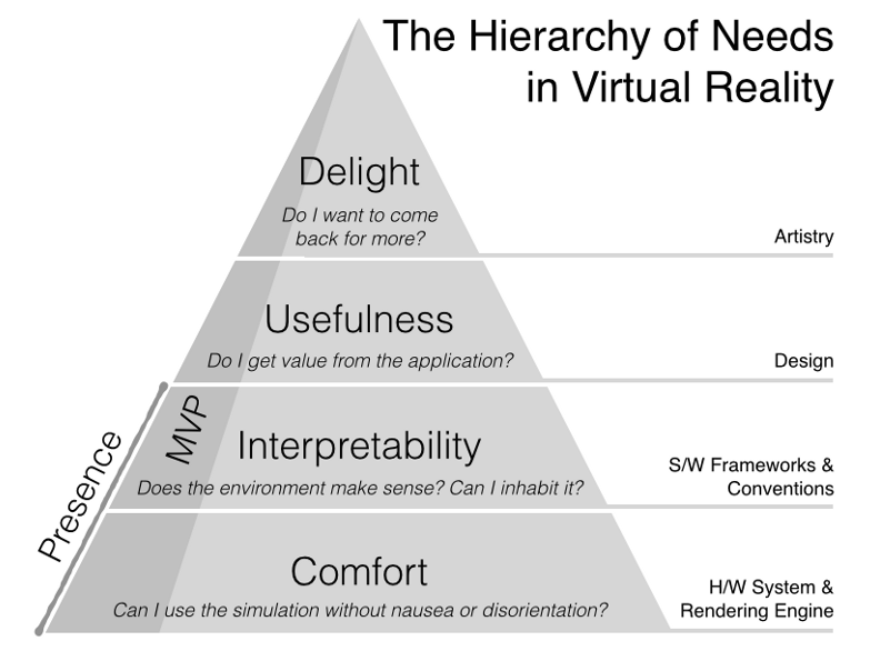
In VR experiences it’s important to consider the needs of the person using what you’ve created. We can look at the Hierarchy of Needs in Virtual Reality that Beau Cronin adapted from Maslow’s Hierarchy of Needs:

When working on a “quick hack” it’s very easy to decide to throw any one or more of these layers away in favor of speed of delivery – I’m only spending a couple of hours on each hack so time is precious. So which things do I usually throw away? How do I decide which rules to break?
Comfort – it’s a given that the VR experience on Google Cardboard is only going to be a fraction of the quality of an experience on an Oculus, Vive, or other dedicated Virtual Reality hardware. Because of this, I find myself willing to let these aspects of the experience slide a little bit. Dodgy movement because we’re using device orientation in the browser? Not a problem. Some flickering because the GPU in the phone can’t handle all of these vertices, not my fault! Super low resolution display means the user can see every pixel? My hands are tied!
Interpretability – Most of my experiences take place on a black/green grid. There’s no context here, you’re just “in the grid”. I’m not trying to generate realistic terrains or make it look like you’re stood in a real room somewhere. Because of this it’s quite hard to get a sense of scale, but I’m not too bothered about that. You’re as tall as you feel like you are, and the scale of the other things in the demo is completely relative to that. This does mean that from one hack to the next you’ll be a mouse or a giant, but that’s okay.
Usefulness – All of the hacks are just small things to play with; they don’t carry much use. They’re a novelty to try on the day I Tweet about their existence and then never come back to. The real benefit of the hacks is the associated write-up and perhaps the source code if you’re that way inclined. So with each experience I’m not making them useful to the person using them, but useful to myself as part of the exercise of creating something.
Delight – This is about the only thing I try to maintain. Need to demonstrate loading 3D models? Hey I like Star Wars so let’s get some Stormtroopers in there. Wouldn’t it be great to also have a Droid? Ah well if I’m going that route, what about some sounds? It’s very easy to add delight in that regard, and very cheap in terms of time to bolt these sort of delights on. There are some aesthetic choices being made each time too, such as colours (I do love a bit of red to go with my green/black).
In this way it’s the Hierarchy of Needs in Quick Google Cardboard Hacks is much simpler.

As we’re time limited, and these are short-lived “quick hacks”, delight is really important. Each experience is a novelty. Usefulness depends on your context – are you learning from the hack? Interpretability and comfort can go out the window, and that’s fine.
Cardboctober day 15
Check out all of my other Cardoctober posts here: /cardboctober.