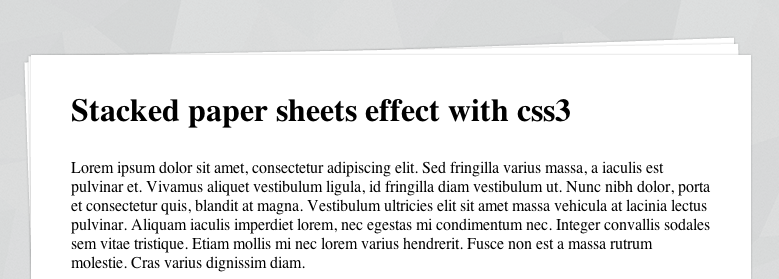
A simple 'stacked paper sheets' effect with CSS3
This is just a short post about an unobtrusive CSS3 effect that I”ve used on some projects lately. Using the ::before and ::after CSS pseudo elements and some CSS3 styles you can make a simple HTML element look like a stack of paper sheets.
Like the sound of that? read on.

First of all, the HTML markup:
<article>
    <h2>Article title here</h2>
    <p>Lorem ipsum dolor sit amet...</p>
</article>
This is only a fraction of what you might have on the page, but I”m sure you can figure that out. This isn”t limited to just the article element either, you can adjust this to use whatever you like. Now, the CSS:
article {
    position: relative;
    margin: 100px auto;
    padding: 40px 0;
    width: 720px;
}
article::before,
article::after {
    content: "";
    width: 710px;
    height: 250px;
    position: absolute;
    left: -2px;
    top: -5px;
    z-index: -1;
    -moz-transform: rotate(-2deg);
    -webkit-transform: rotate(-2deg);
    transform: rotate(-2deg);
}
article::after {
    left: 0;
    -moz-transform: rotate(-1deg);
    -webkit-transform: rotate(-1deg);
    transform: rotate(-1deg);
}
article,
article::before,
article::after {
    background: #fff;
    -moz-box-shadow: 0 0 3px rgba(0,0,0,0.2);
    -webkit-box-shadow: 0 0 3px rgba(0,0,0,0.2);
    box-shadow: 0 0 3px rgba(0,0,0,0.2);
}
That”s the important stuff anyway, so let”s go over this step by step:
- We”re setting the element (in our case, it”s an
article) toposition: relative;. - We”re using
::beforeand::afterto create an empty pseudo element (content: "";) and then positioning it absolutely behind (z-index: -1;) thearticle. - Next, we”re using a CSS3
ransform, in this casetransform: rotate();to rotate the pseudo elements slightly, to give that awesome stacked paper effect. - We”re also applying a CSS3
box-shadowto make it look like the paper is stacked.
That’s all there is to it really, you can tweak the colours and rotation however you like. The only limitation with using the ::before and ::after pseudo elements is that you’re limited to just those two pseudo elements, but if you’re feeling crazy you could use multiple CSS3 box-shadow to simulate more sheets of paper. You can read more about CSS3 box-shadow and transform over on Sitepoint’s guide for mastering box shadows and Sitepoint’s primer on CSS3 transforms.
- You can play with the code here: Code for demo on jsfiddle
- And you can see the result here: Stacked paper with CSS3 demo