On scrolling
Scrolling on the web is something that we take for granted when thinking about how users will interact with our website. There are two schools of thought on the subject: one that’s ingrained in how we interact with what we’re seeing on our screen, and the other ingrained in how we interact with the real world.

While you’re reading this article, if you’re using a standard computer with a mouse that has a scroll wheel, you’re probably scrolling down to read more of the article. Don’t you find it odd that in order to move the page upwards, you’re scrolling downwards? This is even more apparent if you’re using a laptop with a trackpad, where you move your finger in a downward motion to move the page upward.
Perhaps you’re on a smartphone or tablet, or some other device that allows you to have a touch-based interaction with the site, in this case you might be scrolling ‘naturally’ where if you scroll up the page will move upwards, and if you scroll down the page will move downward. This is akin to dragging the page in the direction that you want it to move.
While recently implementing a image scroller/marque/slider, I became aware of an important decision about scrolling direction. This is a subject that I’m sure has been discussed extensively before, but it’s still an interesting subject. I’ll be discussing this based around scrolling within a ‘slider’ device, and scrolling a page.
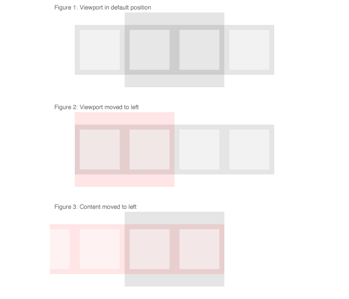
First a diagram of the problem on the X-axis:

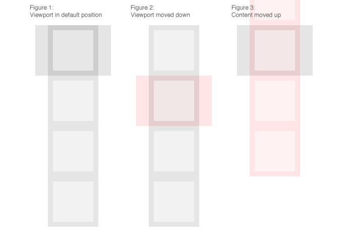
Second a diagram of the problem on the Y-axis:

Figure 1 - The default state. This is before we’ve interacted with the page at all.

Figure 2 - Interaction with a ‘viewport bias’, here the viewport is the component that we’re moving. This is the kind of interaction most people would feel accustomed to. This is how scroll bars in your web browser work, and how your scroll wheel works. This is expected as it’s the way scrolling has been ingrained in to interaction with content on an axis.

Since the early days of terminal computing, the up/down/left/right keys on the keyboard have been used to navigate in their respective directions.
This is comparable to having a long piece of paper suspended in front of you, and then bending your knees to read from the top of the page to the bottom.
If I click on a ‘previous’ or ‘left’ arrow on a slider device I am expecting the viewport to move to the left – in this case, the content will appear to move to the right.
Figure 3 - Interaction with a ‘content bias’, here the content is the component that we’re moving. This is supposedely a more ‘natural’ scrolling technique.

Apple use this on their iOS devices, where you’re interacting by moving the content with your finger. Since Mac OS X Lion this feature has crept in to the desktop too.
This is comparable to holding a long piece of paper in front of you, and then raising the paper higher in to the air to read from the top of the page to the bottom.
If I touch a ‘previous’ or ‘left arrow on a slider, or I make a flicking/swiping gesture to the left, I am expecting the content to move to the left – in this case, the viewport will appear to move to the right.
How does this effect the web?
With websites being developed to be device agnostic, in that the user interaction works as well on a PC as it does on an iPhone, while the site may look visually different some consideration should be made in to how we interact with these kind of devices.
After some Googling though I found some answers, such as the article ‘Gesture Wars’ from Don Norman, in his article he says:
Both models are correct in the sense that both make logical sense. The “correct” answer is that the method of scrolling should match the user’s conceptual model of the activity (usually called the user’s mental model). Whichever method is adopted then requires that all people learn to see the world through that particular conceptual model.
This comment from Larry Tesler on IXDA gives some more insight into why we historically ‘scroll up to go down’, and why scrollbars are designed the way they are.
On the BBC homepage, where I’m sure it’s safe to say they’ve invested a lot of time considering usability, they’re using the ‘viewport biased’ scrolling direction for the slider.
Taking a step back from the interaction/use cases of the device, while implementing this slider, the terms ‘previous’ and ‘next’ are often thought to associate with ‘go left’ and ‘go right’ respectively. Though as it turns out, if you’re implementing something that will be interacted with by mouse, the opposite should happen.