High fidelity in low fidelity emails
Max Glenister
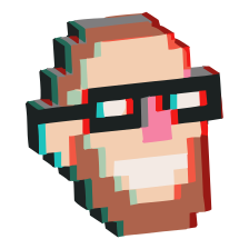
Recently it was pointed out to me that Pizza Express provide a nice fallback for photos on their picture-heavy emails. Take the following example, from a promotional email they sent out earlier this year:

And the same email with images disabled:

And here’s another example:


It looks as if they’ve used this application from Style Campaign to produce the low-fi fallback. It’s a java application that takes a pixel image and outputs either table-based or css-based styled markup, while allowing you to scale up your images. On the Style Campaign blog they’ve got lots more examples of the technique.
It’s an interesting technique, either as a meaningful low-fidelity representation of the missing image, or a subtle easter-egg with a Teletext-esque feel to it. Either way, the low-fidelity version resembles the original image somewhat.
The downside to this though is that there’s a bunch of meaningless table markup behind that simple low-fidelity image, and the original image is then sliced up to fit these constraints, but it’s a HTML email. I’m not surprised to see a couple of tables.
Related posts
- The progress of progress bars
I was waiting for Claude to answer a token-heavy question at work the other day, the little “Thinking…” label flickering into “Wibbling…” and then “Moseying…”, and I caught myself doing the thing I always do when a spinner takes too long, staring at it, trying to divine meaning from the word choice. Is it nearly done? There’s no percentage, no bar, just a word standing in for “trust me, something is happening.” It sent me down a rabbit hole into where progress bars came from, and it turns out they were never really about progress at all.
- Making GIMP feel less like punishment
GIMP has always had an interface problem. I’m not blaming the GIMP team (they’ve built something powerful on a shoestring). They’ve been clear they’re not interested in copying Photoshop wholesale; their FAQ argues that designing around actual user research beats imitating someone else’s interface decisions. Fair enough in principle, but coming from years as a Photoshop user, that design still feels hostile to me. I’m just one user story out of many they’ve had to design for, but it still expects me to learn its own way of doing things rather than offering a config closer to what I’m used to out of the box.
- Your forecast is accurate and still wrong
Icons work because they’re fast. One glance, immediate meaning, no reading required. The tradeoff is that they compress complex information into a single symbol, and compression always drops something.
Discussion
- 2012
- TM
No one expects anything in HTML emails to be honest, as long as they look ok, I don’t care, I think it is an interesting technique.
Join the conversation
Reply from your own site with a Webmention (how?).