Review: The Smashing Book #2

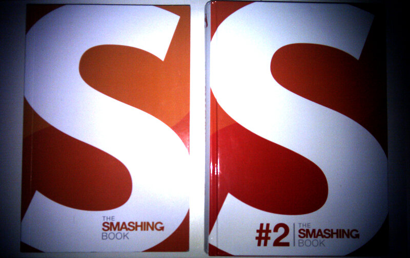
The Smashing Book #2 is a book about web design and development from the folks over at smashingmagazine.com. As the name implies, it’s their second Smashing Book.
When the first Smashing Book was released in 2009, I jumped to the chance of buying a copy. I’ve always been a fan of Smashing Magazine, and figured Smashing Magazine in print form couldn’t be a bad thing (and it would be a nice book for reading on my bus commute to/from work each day).
The first book talked a lot about coding best practice, usability and optimisation but was riddled with issues, from layout/editing issues (the justified text was unbearable, and it had numerous mistakes), to issues with the binding and over-all quality. On their end of the release I believe Smashing Magazine also had production delays too.

The second book is cut from a different cloth in terms of production quality, and article subjects, this time talking more about the philosophies of graphical design, user experience, user behaviour and typography (amongst other topics).
The issues of the first book are now gone, with a lot more time gone into editing/layout, and now contained in hard backing, the book feels like it’s a lot higher quality.
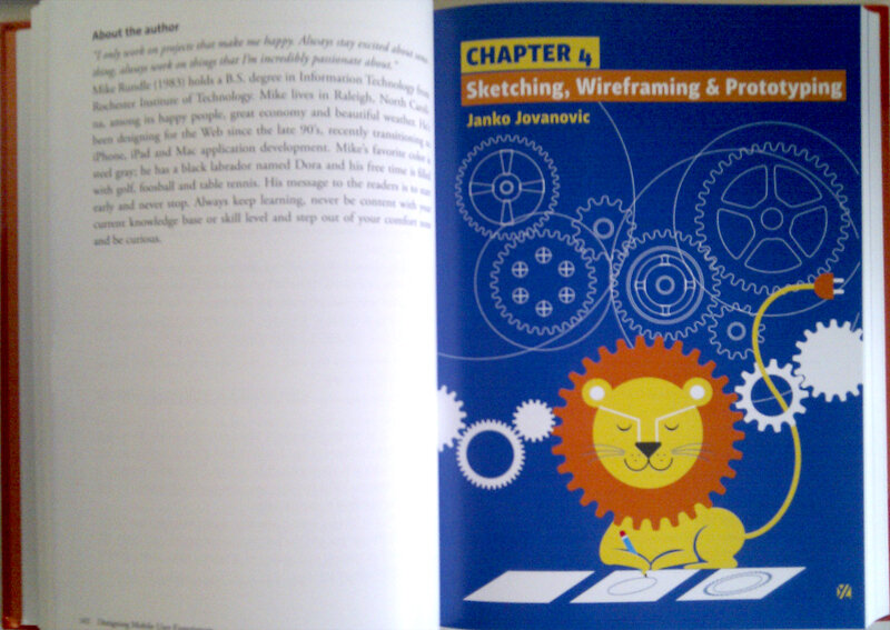
At the start of each section there are illustrations by Yiying Lu (the creator of the Twitter “fail whale” illustration), which provide a good graphical representation of the subject of each section.

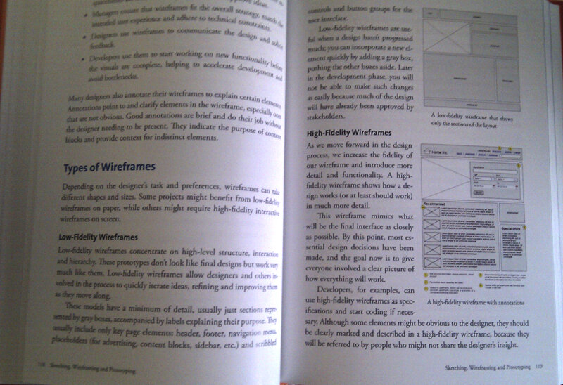
This book is less code-heavy than the first, but features a lot of good quality reading material. Page layouts seem a lot nicer and the articles contain colourful screenshots and representations of what is being discussed, which do a good job of breaking the pages up - though from time to time you will find yourself facing a wall of text, which makes it not ideal for commute-reading in chunks.

Overall I would say this is a much better book than the first Smashing Book. It’s a steal at the same price as the first, and a great resource for any web designer to have on their desk or book shelf.
I look forward to the next Smashing Book when/if it’s released and I hope that Smashing Magazine consider re-releasing their first Smashing Book as a hardback second edition.